


Moose Country Whiskey & Food, Minneapolis
Good design is good business. That's as true a statement as there is in marketing. The trouble is, what's good for me may not be good for someone else. There just isn't any accounting for taste.
I point this out only because I try to showcase menus in these articles that I think represent some pretty good design. However, I also know from more than 25 years of selling art and design, that a client, however well-intentioned, can wrangle even the best designers into creating some real crap.
Besides that, what I try to introduce in these articles is not as much about design as it is about engineering. There are a lot of people who can give a menu a double-dip in the glitz bucket, but it takes real skill to create a menu that will entice customers into making better choices for a restaurant.
A few months ago Terry Peters, Hal Langevin and Dan Salem of U.S. Foodservice, Plymouth, Minnesota, introduced me to Shawn Murray, the general manager of Moose Country Whiskey & Food. Murray was very helpful in getting the basic information we need to do a menu makeover. He provided theoretic food cost for each item, a complete set of menus, and a PMIX (product mix analysis) from his POS (point-of-sale system).
Current Menu
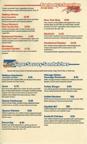
The previous menu had a nice layout. Not much to fault there. The right things were mostly in the right places, and the original graphics were professionally executed. Overall, I've seen a lot worse. What I wanted to improve was the prices. They were not strategic, they were in bold type, which puts a lot of pressure on bargain hunting, and some key items were placed incorrectly.
Also, there were a lot of pieces to the menu, which could be confusing. Besides that, nothing was highlighted, so the customers were left to make up their own minds about what to eat. That may not seem like a bad thing, this being a free country and all. The problem is, most customers will purchase items that have far less value than we restaurant operators would prefer. So having a menu offer some items as choices over others is a good idea.
According to the menu matrix, this operator was selling a lot of Stars, despite the food list-approach to the menu. For example, the hottest-selling sandwich, the Walleye, outsold the next-fastest-selling sandwich by almost two to one. Furthermore, it was bringing in nearly 50 cents over the average Plow Horse. In fact, 41 percent of total sales in the sandwich section was coming from Star performers, which is very healthy for any restaurant.
The entrée section at the time showed more potential than actual sales. Eight out of nine items were Puzzles, and the Fettuccini Alfredo was a Dog. In fact, the Smothered Chicken had not sold at all in this report.
There were a couple of factors contributing to low sales. First, the most difficult items to sell in any restaurant are the most expensive items. Consumers typically shy away from high-cost food. And now with the economy in the tank, it's getting even harder for restaurant operators to sell center-of-the-plate items.
Multiple Choices
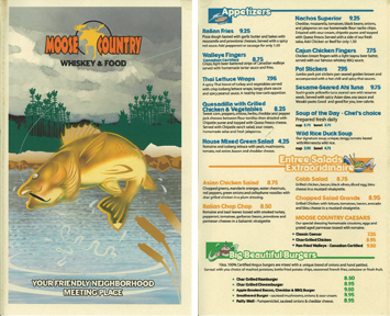
We started by doing a basic layout, new copy and several design trials to get Murray's idea for the next incarnation of his menu. Of the five layouts we created, the client chose a very rustic, woodsy look with a stylized moose on the cover.
While all of the layout choices incorporated some of the old look, our designers gravitated toward the stylized moose illustration. We reduced the menu size a bit so the entire offering could fit into an 8.5-by-14-inch double (four-page) menu. In this way, we were able to offer a more manageable menu. We also were able to take advantage of better positioning, highlighting, mental anchoring and strategic pricing.
To Continue Learning


